CheerLocal: Connecting Communities, Empowering Local Business.
Client: CheerLocal | Service: App Design | My Role: Sole UX/UI Designer | Tools: Figma, Zoom

Overview
This project was undertaken as a freelance engagement for a client who was pursuing his Executive MBA. My client had already conducted extensive market research, user interviews, and competitive analysis as part of his MBA program requirements. He provided me with this comprehensive research data, which clearly outlined the target audience, their needs, pain points, and the desired core functionalities of the application. My specific role was to leverage this research to translate his business idea into a tangible, high-fidelity, clickable prototype. The objective was to effectively showcase the core features and the overall user experience of the CheerLocal application, demonstrating its value proposition to potential investors, partners, and academic advisors. The focus was on clarity, functionality, and a strong visual representation of the business idea, directly informed by the client's prior research.
The Problem
Small local businesses struggle to compete with large retail chains due to a significant disparity in customer engagement and digital accessibility. While big-box stores leverage capital-intensive promotions and advanced digital platforms to build customer loyalty, small business owners lack the resources to maintain this level of engagement. Consequently, customers often lack immediate awareness of local stores' unique offerings, promotions, and community events, leading them to favor the more visible and digitally accessible big-box competitors. The fundamental problem is the absence of a dedicated, accessible platform that empowers small businesses to foster strong customer engagement and community connections, leveling the playing field against larger chains.

Mission Statement
How might we create a dedicated, accessible platform that empowers small businesses to foster strong customer engagement and community connections, leveling the playing field against larger chains?
Key Learnings from the Research:
My design process began with a deep analysis of the client's research data. I synthesized the findings to identify key pain points and motivations for both small business owners and users.
Small Business Owners:
They are highly reliant on location and customer relationships, with most being repeat customers.
Many find it difficult to maintain websites or social media pages due to additional cost and time. They are, however, willing to spend on customer engagement depending on the expected return on investment.
Users (Customers):
Users lack engagement with local stores and are willing to shop locally if it's made convenient.
They are interested in learning about events and promotions happening in their neighborhood.
They also expressed a desire for a single app to manage all their local store engagements, rather than managing too many separate app

Usability testing with the second version of website
Given that a second version of the website had already been created by the previous team, we deemed it essential to conduct a usability test with 5 participants on this version as well before moving forward. This allowed us to pinpoint confusing navigation elements and identify any obstacles in the content delivery, ensuring a smoother user experience moving forward. Comments from the users were gathered on a Miro board where we organized the feedback and suggestions from our usability tests.
3 key tasks users were asked to perform:
Can you find information about the NGO’s mission and values?
If you were to donate, can you show us how would you navigate?
Can you find information on how to contact and volunteer?
Key Insights:
3 out of 5 participants found it difficult to find information about the NGO’s mission and values.
4 out of 5 participants pointed out that they were unclear about how their donations would be used.
3 out of 5 participants struggled to find contact information for volunteering.
Feature Prioritization
Given the four-screen MVP limitation, the focus was on critical features that directly addressed the research findings. The core features identified were:
Dashboard Overview: Immediate access to balance and a clear view of financial activity, directly addressing the need for checking balances and transaction clarity.
Deposit & Transfers: Facilitating quick and seamless money movement through highly efficient processes for both depositing funds into accounts and executing transfer
Goal Setting: Enabling users to set and meticulously track their financial goals, transforming abstract aspirations into actionable, measurable objectives within the app.
Support: Directly addressing the pain point of difficult customer service contact by providing immediate, multifaceted, and intuitive avenues for users to connect with assistance when they need it most.
Visual Design
The visual design for decr emphasizes clarity, modern aesthetics, and ease of use, aligning with user preferences for simplicity.
Color Palette: White and navy Blue colors were selected to create a trustworthy and approachable feel, often associated with stability and financial security.
Typography: A clean, sans-serif typeface was selected to ensure excellent readability.
Iconography: Simple, recognizable icons were selected for navigation and actions mainly to minimizing cognitive load and to help speed up task completion.
Layout: The screens feature a clear hierarchy with ample whitespace, making information digestible. Cards are used effectively to segment content, such as "Insights," "For you," and "Recent Transactions," promoting clear data presentation.
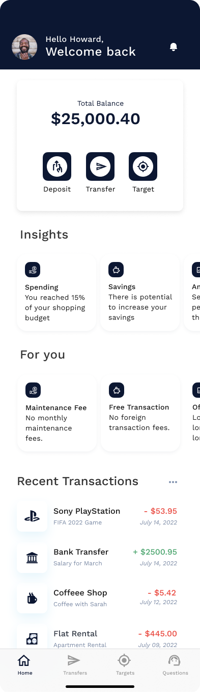
Dashboard
Key Features:
Prominently displayed the total balance for immediate financial clarity, fulfilling the primary user need.
Provided Intuitive buttons for frequently used functions (deposit money, transfer money & set goals), reflecting key user activities.
Offers personalized financial advice and spending breakdowns . This directly addresses the user desire for more clarity on how they are spending their money.
Displays personalized offers or financial tips.
Included a scrollable list providing a detailed history of expenditures, categorized and clearly showing amounts and dates. This offers immediate clarity on financial activity.
Provided an "Insights" and "Recent Transactions" sections to potentially consolidate family-wide spending patterns or suggest ways to save for family goals, aligning with the neobank's family focus.
Transfer Screen
Key Features:
This screen shows frequently used contacts for fast transactions, streamlining the transfer process.
It allows users to quickly select recipients from their contacts list, simplifying the process.
The “Plus” icon provides functionality to find/add new recipients.
The "Contacts" section easily integrate family members/friends for quick transfers between accounts or allowances, promoting financial fluidity within a household.
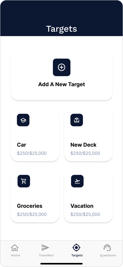
Targets Screen
Key Features:
This screen enables users to set and track financial goals, directly addressing a key user request.
The “Add a New Target” call to action helps users to create new savings goals.
The screen also displays ongoing savings goals with clear progress indicators (e.g., Car, New Deck, Groceries, Vacation), each showing the amount saved vs. the goal. This provides the desired clarity on saving progress.
This screen is particularly vital for families, allowing them to collectively save for shared goals like a new car, vacation, or even education funds, fostering a sense of shared responsibility and financial planning.
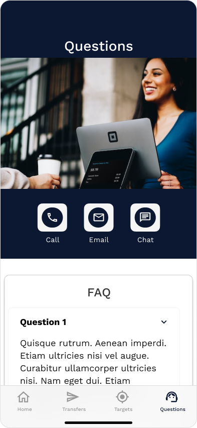
Support Page
Key Features:
This screen directly addresses the significant user pain point of difficulty in contacting customer service.
It prominently displays options for "Call," "Email," and "Chat," offering flexibility based on user preference and urgency.
The FAQ section provides quick answers to common queries, reducing the need for direct contact for simpler issues. The collapsible sections improve usability and allow users to self-serve.
This page overall ensures quick access to support which is paramount for families who might have complex or urgent financial queries related to multiple accounts or transactions, directly alleviating a major frustration.
Solutions & Impact


Conclusion
The decr MVP serves as a robust foundational blueprint for my client's neobank startup. By deeply integrating key user research findings – focusing on core banking tasks, solving customer service frustrations, and enabling financial goal setting and clarity – the design successfully translates a broad vision into a tangible and user-friendly product specifically designed with the nuances of family finances in mind.

Next Steps & Future Considerations
The decr MVP effectively sets the stage for a compelling family-focused neobank, demonstrating the power of user-centered design in bringing innovative financial solutions to life.

User Testing: Conduct usability testing with target family users to validate the effectiveness of the design solutions and identify further areas for improvement, particularly regarding the clarity of insights and goal tracking.
Expand Family-Specific Features: As the product evolves, integrate advanced features like shared accounts with permissions, sub-accounts for children, parental controls, allowance management tools, and tailored financial literacy modules.
Personalization: Further personalize insights and offers based on individual family member profiles, spending habits, and collective financial goals.
Onboarding Flow: Design a comprehensive and engaging onboarding process that clearly communicates the unique benefits of decr for families.